Another bad idea from Ubuntu: replace menus with the HUD
A few years ago, I used Ubuntu almost full time for my main desktop (well, laptop) OS. If someone asked me which Linux they should try as a newbie, I unhesitatingly said “Ubuntu”. Then I switched to Mac OS X, & a few years later Ubuntu started getting weird in some pretty user-unfriendly ways. Now Mark Shuttleworth has published a new post on his blog about the future direction of Ubuntu, & boy it’s a doozy:
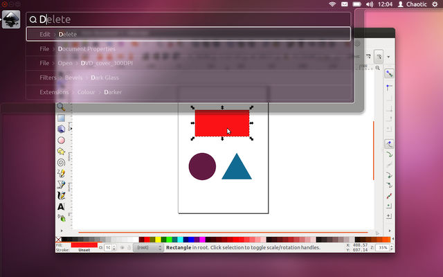
Say hello to the Head-Up Display, or HUD, which will ultimately replace menus in Unity applications. Here’s what we hope you’ll see in 12.04 when you invoke the HUD from any standard Ubuntu app that supports the global menu:
This is the HUD. It’s a way for you to express your intent and have the application respond appropriately. We think of it as “beyond interface”, it’s the “intenterface”.
Intenterface is a horrible word.
Shuttleworth goes on (emphasis his):
Menus serve two purposes. They act as a standard way to invoke commands which are too infrequently used to warrant a dedicated piece of UI real-estate, like a toolbar button, and they serve as a map of the app’s functionality, almost like a table of contents that one can scan to get a feel for ‘what the app does’. It’s command invocation that we think can be improved upon, and that’s where we are focusing our design exploration.
For many, many users, it’s going to be tough to improve on the ease of invoking commands that menus provide. And discounting the second purpose—mapping the app’s functionality—is weird, considering that (a) it’s kinda important, & (b) Shuttleworth asserts that this is a key function but then never explains how moving to the HUD will help with it!
As a means of invoking commands, menus have some advantages. They are always in the same place (top of the window or screen). They are organised in a way that’s quite easy to describe over the phone, or in a text book (“click the Edit->Preferences menu”), they are pretty fast to read since they are generally arranged in tight vertical columns. They also have some disadvantages: when they get nested, navigating the tree can become fragile. They require you to read a lot when you probably already know what you want. They are more difficult to use from the keyboard than they should be, since they generally require you to remember something special (hotkeys) or use a very limited subset of the keyboard (arrow navigation). They force developers to make often arbitrary choices about the menu tree (“should Preferences be in Edit or in Tools or in Options?”), and then they force users to make equally arbitrary effort to memorise and navigate that tree.
Those are some pretty big advantages! And I’m not sure that moving to a HUD would overpower those. And Shuttleworth also left out a big one: they’re familiar, especially to your average user.1
In the next release, due in April, the menus will still be there, but not necessarily in the next release:
We’ll resurrect the (boring) old ways of displaying the menu in 12.04, in the app and in the panel. In the past few releases of Ubuntu, we’ve actively diminished the visual presence of menus in anticipation of this landing. That proved controversial. … If the HUD lands in 12.04 LTS, we hope you’ll find yourself using the menu less and less, and be glad to have it hidden when you are not using it.
Replacing the menus with a HUD is a bad idea, if Ubuntu wants to at all appeal to mainstream users. Nerds will take to a HUD like flies on stink, but most “normal” users will be completely, totally lost without menus.
Note that I said “replacing”. Adding a HUD would be fine, as long as the menus remain. I myself don’t click on menus much, but that’s because I use Alfred as a launcher & task tool, & I have many key commands memorized. In other words, I’m your classic power user. But for the vast majority of users, even adding a HUD would mean nothing to them, because they’ll want to use the menus (or toolbars, in many cases).
The last half of Shuttleworth’s post is about voice:
Searching is fast and familiar, especially once we integrate voice recognition, gesture and touch. We want to make it easy to talk to any application, and for any application to respond to your voice. The full integration of voice into applications will take some time. We can start by mapping voice onto the existing menu structures of your apps. And it will only get better from there.
Hoo boy. Windows & Mac OS X have both had voice for quite some time, & hardly anyone I know uses it. In fact, let me rephrase that—no one I know uses it. I don’t even use it. The biggest reason: it’s still clumsy & unnecessary (when it comes to mobile devices, this is a different story). The other big reason: the annoyance factor. My little office has three people in it, each about four feet from each other. Can you imagine voice control in such a setting? Or in a library where students are studying? Or in a cube farm?
I like Linux a lot. I use it every day, on the server. I respect Ubuntu. But I’m also very glad I don’t rely on it as my desktop OS any longer, especially with ideas like these coming down the pike.
