Stupid design decision of the day, number 2
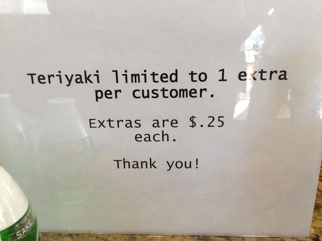
For lunch Jans & I went to San Sai, a local fast food Japanese restaurant. Standing in line, I noticed this sign in front of the people taking orders:

There are lots of really confusing things about this sign.
- Teriyaki what? Sauce? Chicken? (It was sauce)
- How many teriyaki sauces do you get? Are any free? Do you get at most 2—1 free & 1 extra? Or can you have as many extras as you’d like?
- Are all extras $.25? Or just all of them after the first?
I asked the woman taking our orders, and she explained that you get one for free, and you can have as many after that as you’d like, but all of those are $.25 each.
This was a very poorly written sign. If I was still teaching English, I’d have to give this one an F for communication1.
-
That ignores the horrible layout, of course. Why is “each” on its own line? Why is “per customer” on its own line? Terrible. ↩